


No products in the cart.
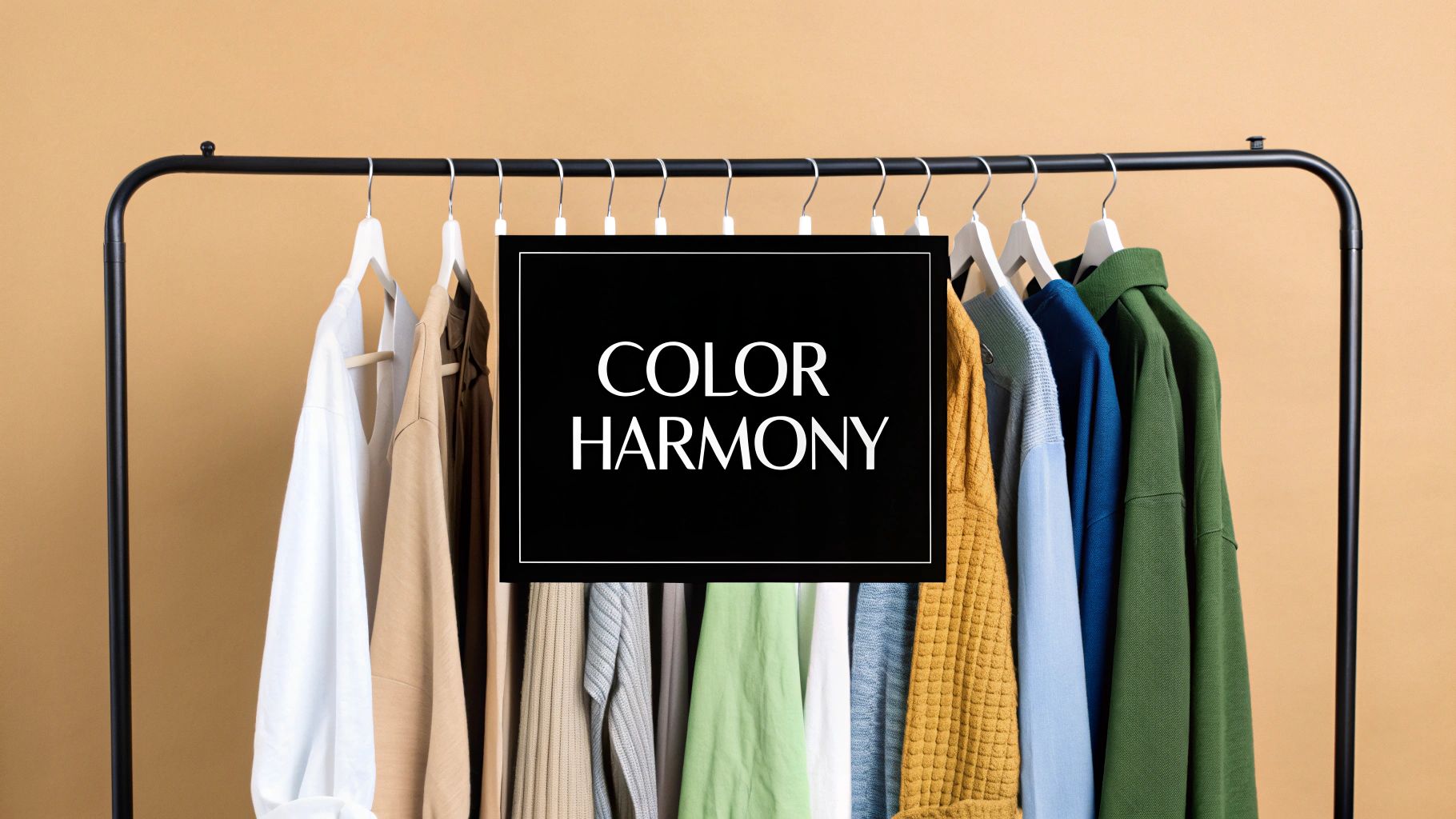
Have you ever looked at someone's outfit and thought it just works? That effortless, polished look often comes down to one thing: color. Learning how to match your clothes isn't about memorizing a long list of rigid rules. It's about grasping a few simple principles that can transform a closet full of individual items into a truly cohesive and stylish wardrobe.
Why Smart Color Choices Transform Your Entire Look
Getting your color combinations right does so much more than just make you look good—it changes how you feel and how people see you. The right palette can make your mornings easier, boost your confidence, and unlock the hidden potential in the clothes you already own. It’s what separates a "thrown-together" outfit from a thoughtfully styled one.
This isn’t about running out to buy a whole new wardrobe. It's about making smarter choices with what you have to create harmony and impact. When the colors in your outfit sing together, the entire look feels intentional and polished, even if you’re just in a t-shirt and jeans.
The Power of Perception and Confidence
The colors you choose to wear send powerful, non-verbal signals. In a professional setting, a well-matched outfit can communicate competence and attention to detail. Just think of a classic navy blazer paired with a crisp white shirt—it feels instantly authoritative and trustworthy.
On the flip side, a vibrant, well-paired combination for a weekend brunch can signal a creative and approachable personality.
When you know your outfit is visually harmonious, you carry yourself with a different kind of energy. You’re not secretly wondering if your top clashes with your pants; you just feel good. That boost in self-assurance is probably the single biggest benefit of learning how to match your clothing colors.
A great outfit is a form of self-expression. By understanding color, you gain a powerful tool to communicate who you are without saying a word, turning your daily routine into a creative act.
More Than Just Art—It's an Industry
While fashion might seem subjective, the importance of precise color matching is a serious business. The textile industry invests heavily in sophisticated technology to make sure the colors you see on the rack are consistent and perfect.
In fact, the global market for material color matching booths—a critical tool for clothing manufacturers—was valued at USD 1.2 billion in 2023 and is expected to nearly double. This just goes to show that creating flawless color harmony is a multi-billion dollar pursuit. You can learn more about the technology behind color matching in textiles and its projected growth.
This guide will demystify the process for you, giving you practical strategies you can use right away. We’ll skip the abstract theory and jump straight into real-world tips to help you build a wardrobe that truly works for you.
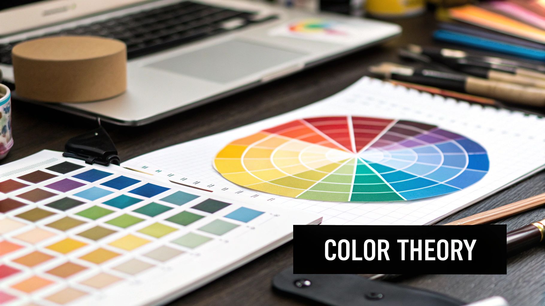
Using the Color Wheel for Effortless Outfit Harmony
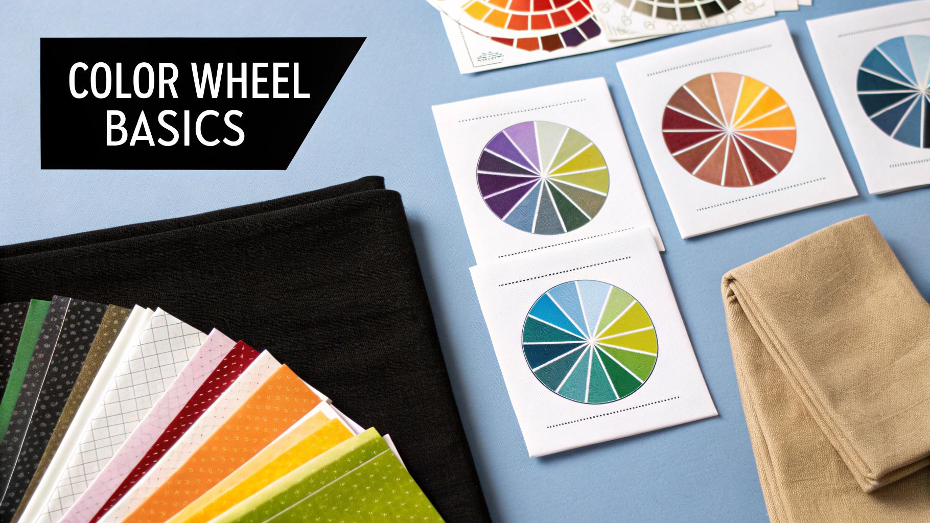
Think of the color wheel as your secret weapon for making sense of your wardrobe. It’s a simple, visual map that takes all the guesswork out of pairing colors, giving you a reliable framework for creating outfits that look intentional and put-together. Instead of randomly grabbing pieces and hoping for the best, you can use these classic color relationships to build specific moods.
This tool isn't just for artists; it's an incredibly practical guide for everyday style. Once you know how to match clothes using the wheel, you can turn a stressful morning into a quick, creative process. You’ll start to see your closet not as a jumble of individual items, but as a palette of possibilities.
Create Impact with Complementary Colors
The most dynamic way to pair colors is by using complementary colors. These are any two colors that sit directly opposite each other on the color wheel. This high-contrast pairing creates a vibrant, eye-catching look that feels energetic and bold. It just works.
But don't let "high-contrast" scare you—it doesn't have to mean loud. You have total control over the intensity by playing with different shades and tones. A bright, true red with a kelly green might feel a bit too festive for the office, but a deep burgundy paired with a muted olive green? That feels rich and sophisticated.
Here are a few real-world examples you can try:
- Navy and Burnt Orange: A timeless, winning combination. Think of a classic navy blazer with a burnt orange pocket square, or a cozy rust-colored sweater.
- Deep Purple and Mustard Yellow: This pairing feels both regal and earthy. A mustard-colored blouse under a deep plum cardigan is a perfect look for autumn.
- Teal and Coral: A fresh, modern combination that’s fantastic for spring and summer outfits.
Key Takeaway: For a confident and memorable outfit, choose two colors from opposite sides of the wheel. This creates a visual "pop" that is both balanced and exciting.
Achieve Calm with Analogous Colors
For a more subtle and serene effect, turn to analogous colors. These are colors that sit right next to each other on the color wheel, like blue and green. This approach creates a harmonious, low-contrast look that feels incredibly cohesive and elegant.
Because these colors are neighbors, they naturally blend well together, resulting in a look that is easy on the eye. An analogous scheme is less about making a bold statement and more about creating a sophisticated, unified aesthetic. It's one of the easiest ways I know to look polished without looking like you tried too hard.
The decision to use certain color schemes isn't random; it's deeply connected to our personal and social needs. Research actually highlights that our fashion choices are complex, influenced by everything from our mood and body image to cultural trends. We often select complementary or analogous colors to strike a balance between expressing our uniqueness and fitting in socially. You can read the full study on color choice patterns to dive deeper into the psychology behind it.
Try These Analogous Pairings
- Blue, Teal, and Green: Imagine a pair of navy trousers, a teal top, and a muted olive green jacket. Effortlessly chic.
- Red, Orange, and Pink: A beautiful sunset-inspired palette. This could be a soft pink top paired with a red-orange patterned skirt.
- Blue, Indigo, and Violet: This creates a cool-toned, calming effect that always looks incredibly smart and put-together.
Building a Versatile Wardrobe with a Core Color Palette
A truly functional wardrobe isn’t about having a closet packed with clothes; it's about having the right clothes that work together. The secret to effortlessly matching colors and always having something to wear is building your wardrobe around a core color palette.
This strategy is a game-changer. It turns a closet full of one-off items into a cohesive system where almost everything pairs beautifully. You end up with a smart, versatile collection that makes getting dressed feel easy instead of overwhelming.
Start with a Neutral Foundation
First things first: you need to choose two to three core neutral colors. These are the workhorses of your wardrobe, the foundation for the vast majority of your outfits. I'm talking about timeless shades like navy, charcoal grey, cream, camel, or classic black.
These colors act as your anchor points. They're inherently sophisticated and provide the perfect canvas for more exciting pieces. A great pair of grey trousers, a classic navy blazer, or a simple cream sweater can be styled in countless ways.
This visual shows just how powerful neutrals are in creating a balanced wardrobe.
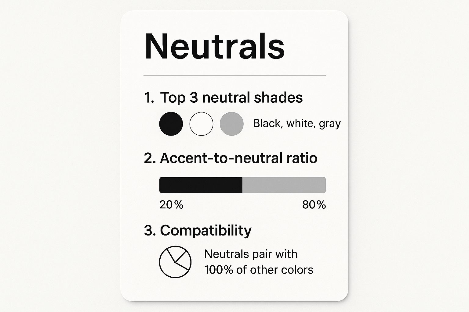
The key takeaway is a version of the 80/20 rule. When your wardrobe is built with roughly 80% neutral pieces, you create a stable foundation that allows the remaining 20%—your accent colors—to really shine without clashing.
To better understand this, let's compare how these two types of colors function in your closet.
Core Neutral vs. Accent Color Wardrobe Planning
| Wardrobe Role | Color Examples | Purpose in Outfits | Best for These Items |
|---|---|---|---|
| Core Neutrals | Black, Navy, Grey, Cream, Camel, White | Create the foundational base; provide versatility and longevity. | Coats, Trousers, Blazers, Core Knitwear, Basic Tees, Shoes |
| Accent Colors | Emerald, Cobalt, Red, Dusty Rose, Teal | Inject personality and visual interest; easily swapped for variety. | Blouses, Scarves, Handbags, Statement Shoes, Dresses, Accessories |
This table shows the clear distinction: neutrals are your investment pieces that form the structure, while accents are the fun, expressive items that bring your personal style to life.
Layer in Your Accent Colors
With your neutral base established, it's time for the fun part—adding your accent colors. These are the shades that inject personality and life into your outfits. Think of a bold emerald green blouse, a pair of striking cobalt blue shoes, or a patterned scarf with hints of coral.
This is where you get to play and express yourself. Since the bulk of your wardrobe is neutral, you can easily swap these accents in and out depending on your mood, the season, or the occasion.
Pro Tip: Don't think your accent colors have to be loud or neon. A soft dusty rose, a muted olive green, or a rich burgundy can all serve as beautiful accents. The goal is simply to create contrast and visual pop against your neutral backdrop.
This foundational approach is also a cornerstone of creating a more streamlined, minimalist closet. For a deeper dive, our minimalist wardrobe checklist offers practical steps to get you started.
Putting It All Together: A Practical Example
Let’s say you’ve chosen navy and camel as your core neutrals. Here’s how easily you could build an outfit:
- Your Neutral Base: You might own navy trousers, a camel trench coat, a navy wool sweater, and camel loafers. All of these pieces work together effortlessly.
- Adding an Accent: Now, bring in an accent color like a deep teal. A teal button-down shirt looks instantly chic tucked into your navy trousers and layered under the camel coat.
- Switching It Up: The next day, you could swap that teal shirt for a simple white top and add a vibrant red handbag. The red provides a completely different energy, popping beautifully against the navy and camel with minimal effort.
This method transforms your closet from a random collection of clothes into a powerful system. Every new accent piece you buy already has a dozen potential partners waiting. It makes matching colors second nature—giving you more style with less stress.
Bringing It All Together: Practical Ways to Pair Colors and Patterns
With the basics of color theory under your belt, it's time for the fun part—actually putting outfits together. Moving beyond the color wheel and into your closet is where the magic happens. These are the go-to techniques that stylish people use every day, often so naturally it seems like second nature.
One of the most powerful and surprisingly simple methods is monochromatic dressing. This isn't about wearing the exact same color from head to toe. Instead, you build an outfit using different shades, tints, and tones of a single color family. Think about pairing light-wash jeans with a classic navy blue sweater, then finishing the look with a sky-blue scarf.
The effect is instantly chic and pulled-together. It creates a clean, unbroken line that can make you look taller and more streamlined. An all-over look in shades of cream, charcoal gray, or even olive green is a surefire way to look polished with very little fuss.
The 60-30-10 Rule: Your Secret to Balanced Outfits
Borrowed from the world of interior design, the 60-30-10 rule is an incredible framework for creating color harmony in your outfits. It's less of a strict rule and more of a guideline to prevent your look from feeling overwhelming or chaotic.
Here’s the simple breakdown for your wardrobe:
- 60% is your dominant color. This is the foundation of your look and takes up the most space. It's often one of your core neutrals, like a khaki trench coat or a black dress.
- 30% is your secondary color. This color plays a supporting role and should be about half as prominent as your main color. Good examples are a shirt worn under a jacket or a cardigan layered over a top.
- 10% is your accent color. This is where the personality comes in! Use this sliver of your outfit for a pop of color on accessories—a bright handbag, a vibrant tie, a belt, or a bold pair of shoes.
Imagine putting on a navy suit (60% dominant), then a crisp light blue shirt (30% secondary). To complete it, you could add a pop of personality with a burnt orange pocket square and matching socks (10% accent). This simple ratio ensures your colors work together instead of fighting for attention.
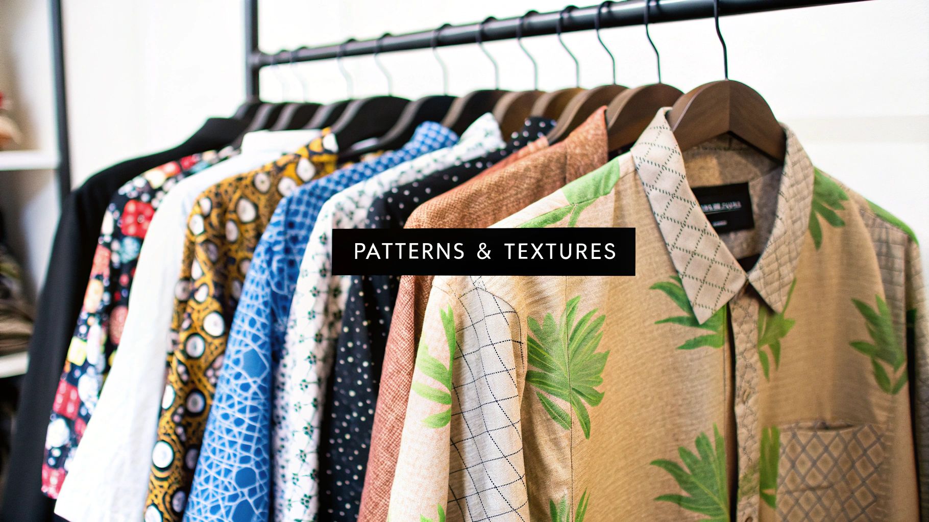
How to Mix Patterns Without a Misfire
Mixing patterns can feel like advanced-level stuff, but it's one of the best ways to inject your personality into your wardrobe. The real secret isn't complicated at all: just find a common color to tie the two prints together.
Let a unifying hue anchor your patterned pieces. Say you have a floral-print skirt with hints of green, cream, and dusty rose. You can confidently pair it with a solid green top. The solid green pulls out the green from the skirt's pattern, creating an instant connection that makes the whole outfit feel intentional.
Pro Tip: When you're mixing two patterns, like pinstripes and plaid, play with the scale. Try pairing a shirt with very fine, delicate stripes with a blazer that has a much larger, bolder plaid pattern. The contrast in size helps each print shine on its own without clashing.
This drive for well-put-together looks is more than just a feeling; it's a huge market force. The decorated apparel market was valued at nearly USD 29 billion in 2023, driven by people wanting unique colors and prints that reflect who they are. If you're curious about the data, you can explore the decorated apparel market analysis from GrandViewResearch.com.
Getting good at this is easier than you think. To build your confidence, take a look at our complete guide on how to mix patterns like an expert for even more in-depth advice and examples.
Matching Colors to Your Skin Tone for a Radiant Look
While the color wheel gives us a solid foundation for pairing clothes, the real magic happens when you start matching colors to your own skin tone. It's the difference between an outfit that's just "nice" and one that makes people say, "Wow, you look incredible!" The right shades can make you look rested and vibrant, while the wrong ones can, frankly, make you look tired or washed out.
The secret ingredient here is your skin's undertone. This is the subtle hue just beneath your skin's surface that never changes, even if you get a tan. It typically falls into one of three buckets: cool, warm, or neutral. Figuring out yours is the single best thing you can do to build a wardrobe that makes you glow.
A Simple Trick to Find Your Undertone
You don't need a complex analysis for this. Just a quick, practical test. Find some natural daylight and take a look at the veins on the inside of your wrist.
- Cool Undertone: Do your veins look mostly blue or even a little purple? You've likely got cool undertones. You'll find that deep, rich jewel tones are your power colors.
- Warm Undertone: If your veins appear more greenish or olive, you're probably in the warm-toned camp. Earthy, nature-inspired colors will look fantastic on you.
- Neutral Undertone: Can't really tell? If you see a mix of blue and green, you're likely neutral. Congratulations—this means you can pull off just about any color with ease!
If you want to dive deeper into this, you can even find your color season with a quick quiz to get a super-personalized color palette.
Colors That Will Make You Shine
Once you know your undertone, you can start strategically choosing colors that amplify your natural radiance. These aren't hard-and-fast rules, but think of them as your personal cheat sheet to looking your best.
For Cool Undertones, Reach For:
- Jewel Tones: Think sapphire blue, emerald green, ruby red, and deep amethyst.
- Cooler Hues: Bright blues, lavender, and pastels with a distinct pink or blue base will look stunning.
- Crisp Neutrals: Pure, bright white and silvery grays are your go-to neutrals.
For Warm Undertones, Try These:
- Earthy Shades: Colors like terracotta, mustard yellow, olive green, and rich chocolate browns will make your skin come alive.
- Warmer Hues: Look for coral, peach, gold, and fiery reds that lean toward orange.
- Creamy Neutrals: Instead of stark white, opt for off-white, cream, and warm taupe.
At the end of the day, the best color you can wear is the one that makes you feel confident. Use these tips as a guide to get started, but don't ever let them stop you from wearing a color you truly love. Personal style is all about expressing the best version of yourself.
Common Questions About Matching Clothes Colors
https://www.youtube.com/embed/II0t_Vl_-GI
Even after you've got a handle on color theory and have a solid plan for your wardrobe, you'll still face those moments of doubt. Standing in front of your closet, you might wonder if a certain combination really works. Knowing how to match clothes colors is often about confidently navigating these common dilemmas.
Let's clear up some of those nagging questions. Think of this as your go-to guide for those last-minute decisions, helping you put the finishing touches on your look with certainty.
What About Black and Brown or Black and Navy?
This is one of the oldest style debates out there, but the answer is surprisingly simple: Yes, you absolutely can! The secret is making it look deliberate and not like you got dressed in the dark.
When pairing black and brown, contrast is your best friend. Imagine a rich, warm cognac brown belt and shoes against a sharp pair of black trousers—it's a classic, confident look. What you want to avoid is pairing shades that are too close, like a faded black with a dark chocolate brown. That’s when it can look like a mismatch.
The same idea works for black and navy. A crisp navy blazer with sleek black pants is incredibly chic and modern. It’s a powerful combination that proves some style rules were made to be broken.
Key Takeaway: For dark neutrals like black with brown or navy, make the contrast obvious. A clear difference between the shades ensures the pairing looks intentional and stylish, not like an accident.
How Many Colors Are Too Many in One Outfit?
This is a fantastic question. As a general rule of thumb, sticking to three or four colors max is a safe bet. This keeps your outfit looking cohesive without becoming visually overwhelming. The 60-30-10 principle we talked about earlier is your best guide here.
- Your dominant color sets the foundation, usually a neutral.
- Your secondary color adds visual interest.
- Your accent color delivers that final pop.
You can sometimes sneak in a fourth color, maybe in a subtle pattern or a small accessory, but pushing past that number gets complicated. Keeping your color palette limited is the easiest way to look polished.
For instance, you could start with navy trousers (dominant) and a white shirt (secondary). Then, bring in a pop of red with your shoes or a pocket square (accent). A watch with a brown leather strap could easily serve as a subtle fourth color that complements the look without competing.
This simple guideline is one of the most practical ways to master how to match clothes colors day-to-day, guaranteeing your outfits always look put-together.
Ready to discover more than just style tips? At FindTopTrends, we curate the best products across every category, from fashion and tech to home essentials. Stay ahead of what’s next and shop smarter. Explore the latest trends on findtoptrends.com
Leave a comment


